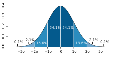
標準偏差の範囲で色分けします
<!DOCTYPE html>
<html>
  <head>
    <!-- Load plotly.js into the DOM -->
    <script src="https://cdn.plot.ly/plotly-2.27.0.min.js"></script>
  </head>
  <body>
    <div id="myDiv"><!-- Plotly chart will be drawn inside this DIV --></div>

    <p>データの個数:<span id="pieces"></span></p>
    <p>平均:<span id="average"></span></p>
    <p>分散:<span id="variance"></span></p>
    <p>標準偏差σ:<span id="sd"></span></p>

    <script>
      const nd = [];
      var nd1 = [];
      var nd2 = [];
      var nd3 = [];
      var nd4 = [];

      function getRandomValue() {
        var x, y, z;
        for (let i = 0; i < 100000; i++) {
          x = Math.random();
          y = Math.random();
          z = Math.sqrt(-2 * Math.log(x)) * Math.cos(2 * Math.PI * y);
          nd.push(z);
        }
      }

      // getRandomValue()を呼び出して100,000回発生させる
      getRandomValue();

      // データの個数を表示
      document.getElementById("pieces").textContent = nd.length;

      // データの合計を求める
      const sum = nd.reduce((a, b) => a + b, 0);

      // データの平均を求める
      const average = sum / nd.length;
      document.getElementById("average").textContent = average;

      // データの分散を求める
      const sumSquaredDiff = nd.reduce((a, b) => a + (b - average) ** 2, 0);
      const variance = sumSquaredDiff / nd.length;
      document.getElementById("variance").textContent = variance;

      // データの標準偏差を求める
      const standardDeviation = Math.sqrt(variance);
      document.getElementById("sd").textContent = standardDeviation;

      // ヒストグラムの各バーに対する色を決定する関数
      function getColor(value) {
        const deviation = Math.abs(value - average) / standardDeviation;
        if (deviation <= 1) {
          return "green"; // 1標準偏差以内
        } else if (deviation <= 2) {
          return "blue"; // 2標準偏差以内
        } else if (deviation <= 3) {
          return "orange"; // 3標準偏差以内
        } else {
          return "red"; // 3標準偏差以上
        }
      }

      // データを各範囲に分ける
      nd.forEach((value) => {
        const color = getColor(value);
        if (color === "green") {
          nd1.push(value);
        } else if (color === "blue") {
          nd2.push(value);
        } else if (color === "orange") {
          nd3.push(value);
        } else if (color === "red") {
          nd4.push(value);
        }
      });

      var trace1 = {
        x: nd1,
        type: "histogram",
        marker: {
          color: "green",
        },
        xbins: {
          end: 5,
          size: 0.1,
          start: -5,
        },
      };

      var trace2 = {
        x: nd2,
        type: "histogram",
        marker: {
          color: "blue",
        },
        xbins: {
          end: 5,
          size: 0.1,
          start: -5,
        },
      };

      var trace3 = {
        x: nd3,
        type: "histogram",
        marker: {
          color: "orange",
        },
        xbins: {
          end: 5,
          size: 0.1,
          start: -5,
        },
      };
      var trace4 = {
        x: nd4,
        type: "histogram",
        marker: {
          color: "red",
        },
        xbins: {
          end: 5,
          size: 0.1,
          start: -5,
        },
      };

      var data = [trace1, trace2, trace3, trace4];

      var layout = {
        bargap: 0.05,
        bargroupgap: 0.2,
        title: "Sampled Results",
        xaxis: { title: "Value" },
        yaxis: { title: "Count" },
      };

      Plotly.newPlot("myDiv", data, layout);
    </script>
  </body>
</html>
結果
データの個数:
平均:
分散:
標準偏差σ:

コメント