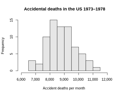
前回作成したヒストグラムをいじっていきます。
まずは、棒グラフの色を青に、一応縁取りは白にしますが、とりあえず太さを0にしています。
        autobinx: false,
        marker: {
          color: "blue",
          line: {
            color: "white",
            width: 0,
          },
        },
グラフの初期値を0、終わりを1、データ間隔を0.01に設定
        xbins: {
          end: 1,
          size: 0.01,
          start: 0,
        },
レイアウトやタイトル等は以下のように、そしてnewPlotに追加するのを忘れずに
      var layout = {
        bargap: 0.05,
        bargroupgap: 0.2,
        title: "Sampled Results",
        xaxis: { title: "Value" },
        yaxis: { title: "Count" },
      };

      Plotly.newPlot("myDiv", data, layout);
全て記すと以下のようなコードに
<!DOCTYPE html>
<html>
  <head>
    <!-- Load plotly.js into the DOM -->
    <script src="https://cdn.plot.ly/plotly-2.27.0.min.js"></script>
  </head>
  <body>
    <div id="myDiv"><!-- Plotly chart will be drawn inside this DIV --></div>
    <script>
      var x = [];
      for (var i = 0; i < 500; i++) {
        x[i] = Math.random();
      }

      var trace = {
        x: x,

        autobinx: false,
        marker: {
          color: "blue",
          line: {
            color: "white",
            width: 0,
          },
        },

        type: "histogram",

        xbins: {
          end: 1,
          size: 0.01,
          start: 0,
        },
      };
      var data = [trace];

      var layout = {
        bargap: 0.05,
        bargroupgap: 0.2,
        title: "Sampled Results",
        xaxis: { title: "Value" },
        yaxis: { title: "Count" },
      };

      Plotly.newPlot("myDiv", data, layout);
    </script>
  </body>
</html>
結果はこんな感じです

コメント